MEASURE THE STREET
BACKGROUND
As urbanization has been happening all over the world, a wide variety of patterns of urban fabric has been invented and developed. It can be a recent city built on top of ancient remnants, or a brand new metropolis starting from scratch. The result of hundreds of design competitions and thousands of political decisions made every city moving forward in an unparalleled way. After two hundred years of global urbanization, whether a city functions economically efficiently is not the only criteria of being a “good city” anymore. As liberty, equality, diversity, etc. become the leading values of the modern society, people start to pay more attention to individual happiness and try to redefine the term of “good life”. Health, aesthetic pleasure and interpersonal communication are gaining higher and higher priority on every citizen’s life list.
The street as the most common as well as crucial public space, which serves as the skeleton of a city, is shaping city dwellers’ everyday life. They walk along the street to go to work, they pass across an intersection to get into a shopping mall, or they wander around in the street just to escape from their personal affairs. They spend a significant amount of time in the street, which makes the street, not a passage that connects two destinations or an unoccupied space between buildings, but a place for them to appreciate the man-made world. In this case, the questions of what are the key factors that make a street comfortable and delightful and how to create a more attractive street are profoundly consequential.
HYPOTHESIS
The street is typically made of the facade of buildings on both sides, the canopy of vegetation planted along sidewalks and the paving of both vehicle lanes and the pedestrian paths. These three elements, to some degree, can be referred to the wall, ceiling, and floor of a house, respectively. How do we conceive a space that can provide an appropriate feeling of scale, thus making it more interactive and inviting?
METHODS AND PROCESSES
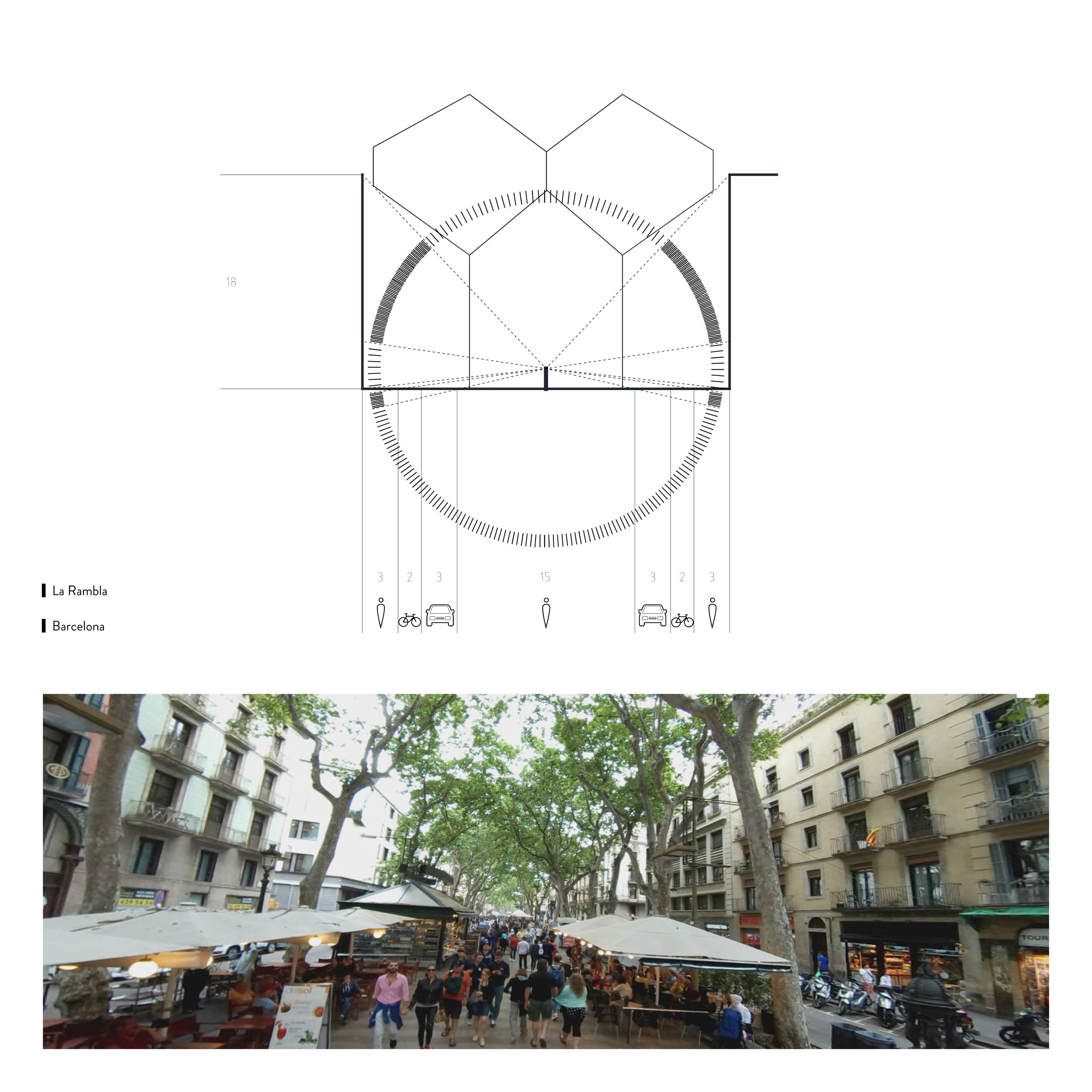
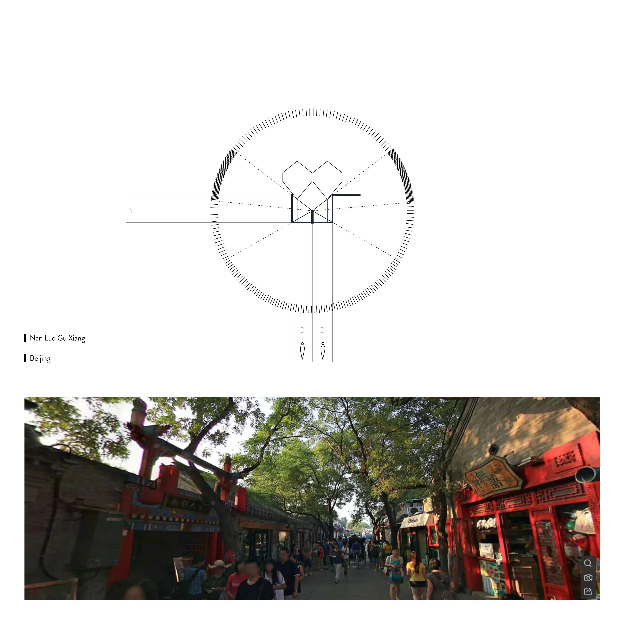
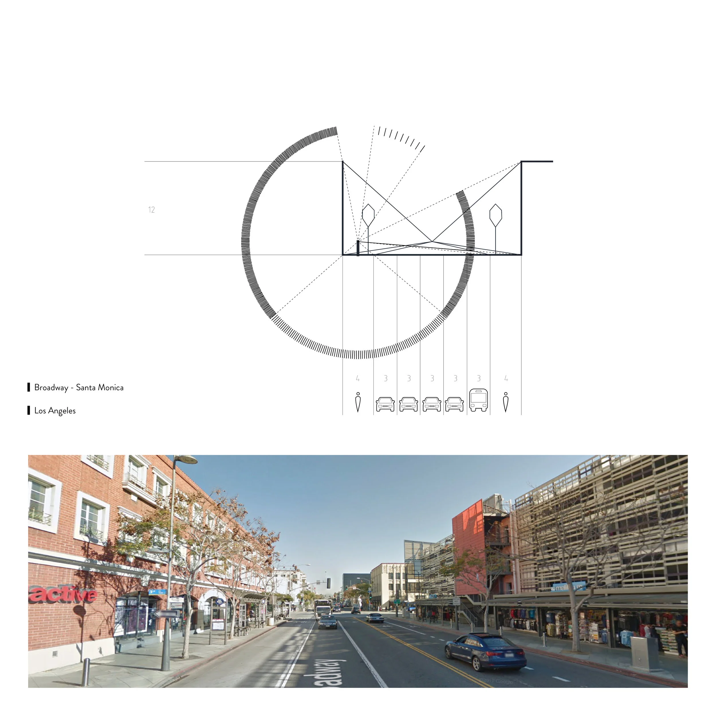
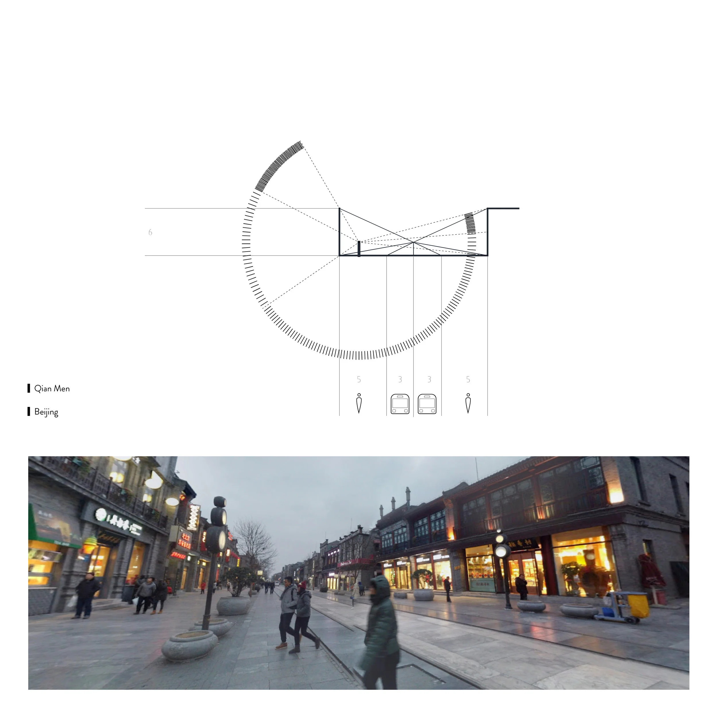
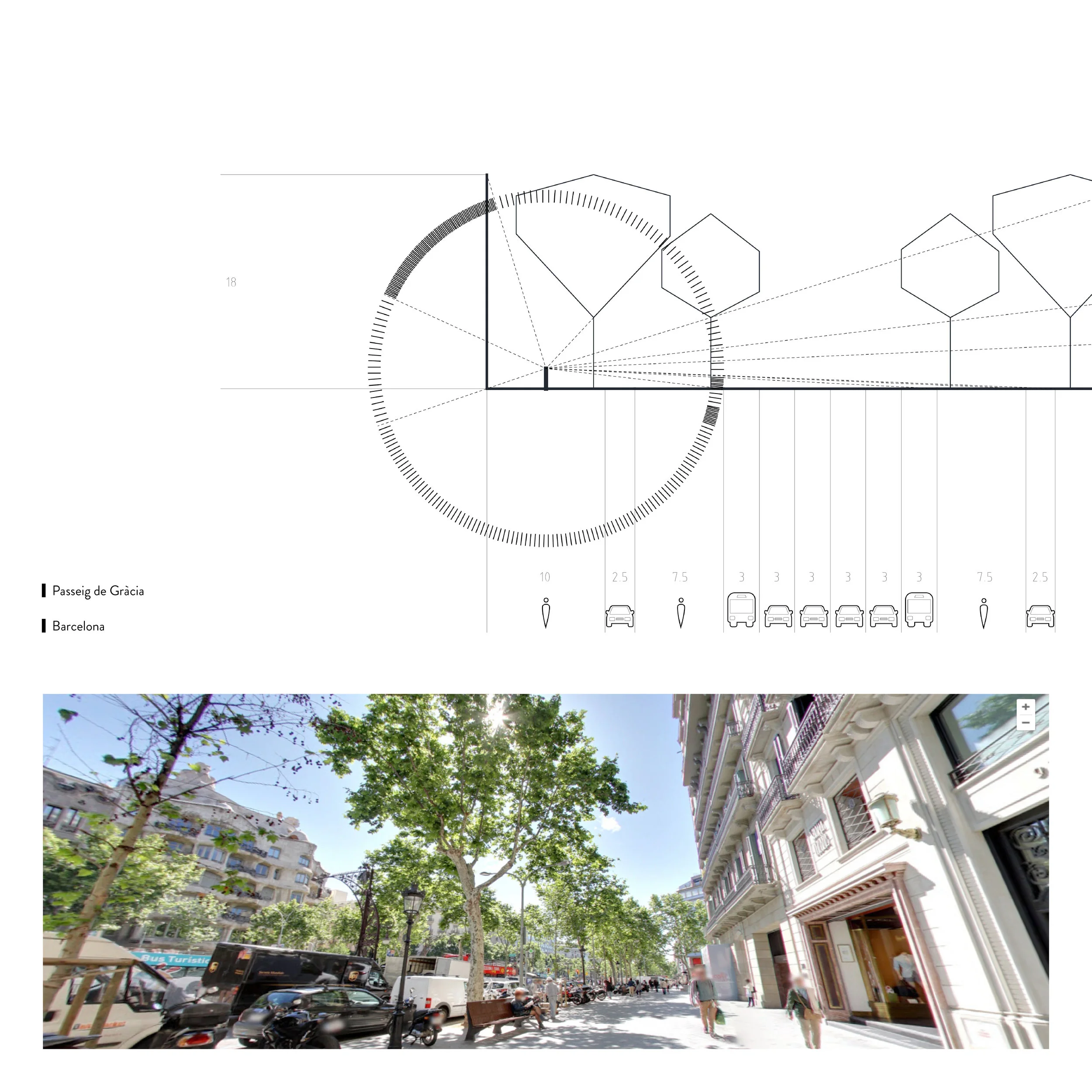
In this study, three main elements of a street were considered, namely facade, canopy, and pavement. As the human eye is perceiving the outside world through projecting three-dimensional objects to a two-dimensional surface, we can, therefore, visualize the street view into a simplified diagram. In this diagram, the facade of buildings was categorized as nonporous (blank wall) and porous (shops, entrances to residence). The pavement was divided into asphalt (vehicle lanes), concrete (sidewalks), tiles (pedestrian ways). As for the canopy, which is more complex, I classified it into four levels - dense, medium, sparse and none (sky). By simplifying the perspective view of one who is walking along the street, I tried to explore the link among “pleasant” streets that are of different scales and materiality. There were ten cases chosen to be compared. One from Shanghai, one from New York City, two from Beijing, two from Los Angeles and four from Barcelona. These streets are representative regarding the scale of the surrounding and the composition of the three elements.
1) La Rambla, Barcelona vs Nan Luo Gu Xiang, Beijing
La Rambla and Nan Luo Gu Xiang are two busy streets that are considered vibrant and attractive to both tourists from all around the world and local residents. Their dimensions are quite different with the width of La Rambla 30 meters while that of Nan Luo Gu Xiang 6 meters. What is common is that both of them have a large portion of the street paved with tiles or bricks, which are for pedestrians only. They have the ground floor of the buildings on the side open to the public, which makes horizontal movement and stoppings possible for visitors. The proportion of the height of the tree and the height of the facade is similar in these two cases. The trees start to branch high enough to show the most part of the building facade but not exceeding the top of the roof. This relation between the “ceiling” and the “wall” creates a comfortable feeling of enclosure, not too exposed but highly secured.
2) Broadway vs 4th Street in Santa Monica, Los Angeles vs Qian Men, Beijing
The two streets in Los Angeles are sited extremely close in the same neighborhood. One is perpendicular to the other. The scale of the streets and the buildings are similar while the 4th street is much more walkable than the Broadway. One possible cause could be the former has “porous” ground floor with small shops opening to the street while the latter has big shopping malls and companies on both sides that have huge blank walls facing the sidewalk. Another cause is that the
former has umbrella-shape vegetations planted in an array of proper interval distance. The latter, however, is punctuated with sparse trees that have a fairly light-texture canopy. It is not surprising that the latter has created a more unenclosed atmosphere, which accelerates the passing speed of pedestrians, or even worse, prevents people from entering the street. This hypothesis can be well proved in the case of Qian Men in Beijing. The dimension of the street and the building is similar to the 4th street, while there is an enormous gap between facades on both sides on the street. Just as a room without a ceiling, it is porous, absolutely, but it is more than porous - it is a hole. A pure sky without any filter would give pedestrians the impression of being unprotected. They have higher possibility to be exposed to strong wind, heavy rain, bright sun and any other attacks. Even though the paving of Qian Men is made of tiles, which are somehow porous and walkable, and the ground floor is accessible from the street, the pedestrians are still suffering from the feeling of being accommodated in a bad enclosure.
3) 41th Street, New York City vs Gothic City, Barcelona vs Shikumen, Shanghai
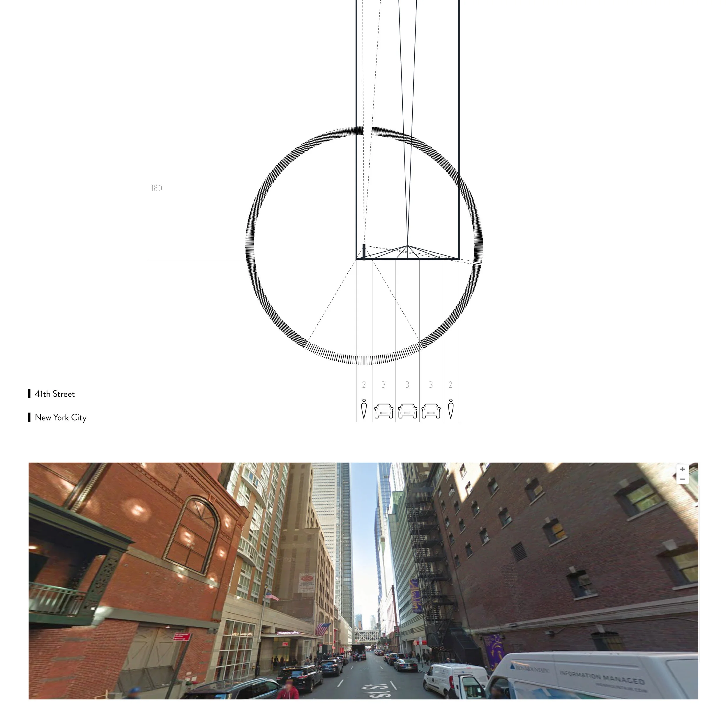
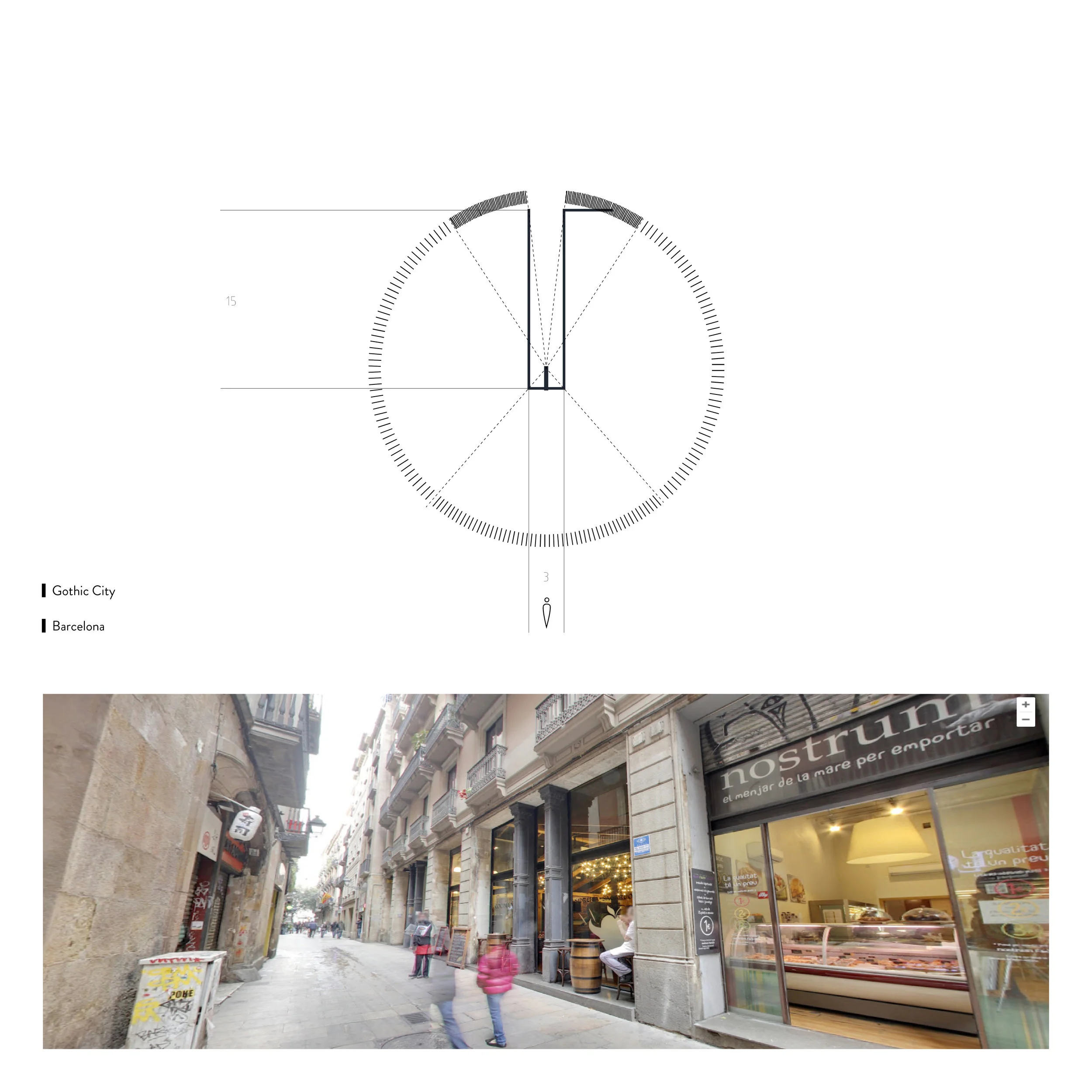
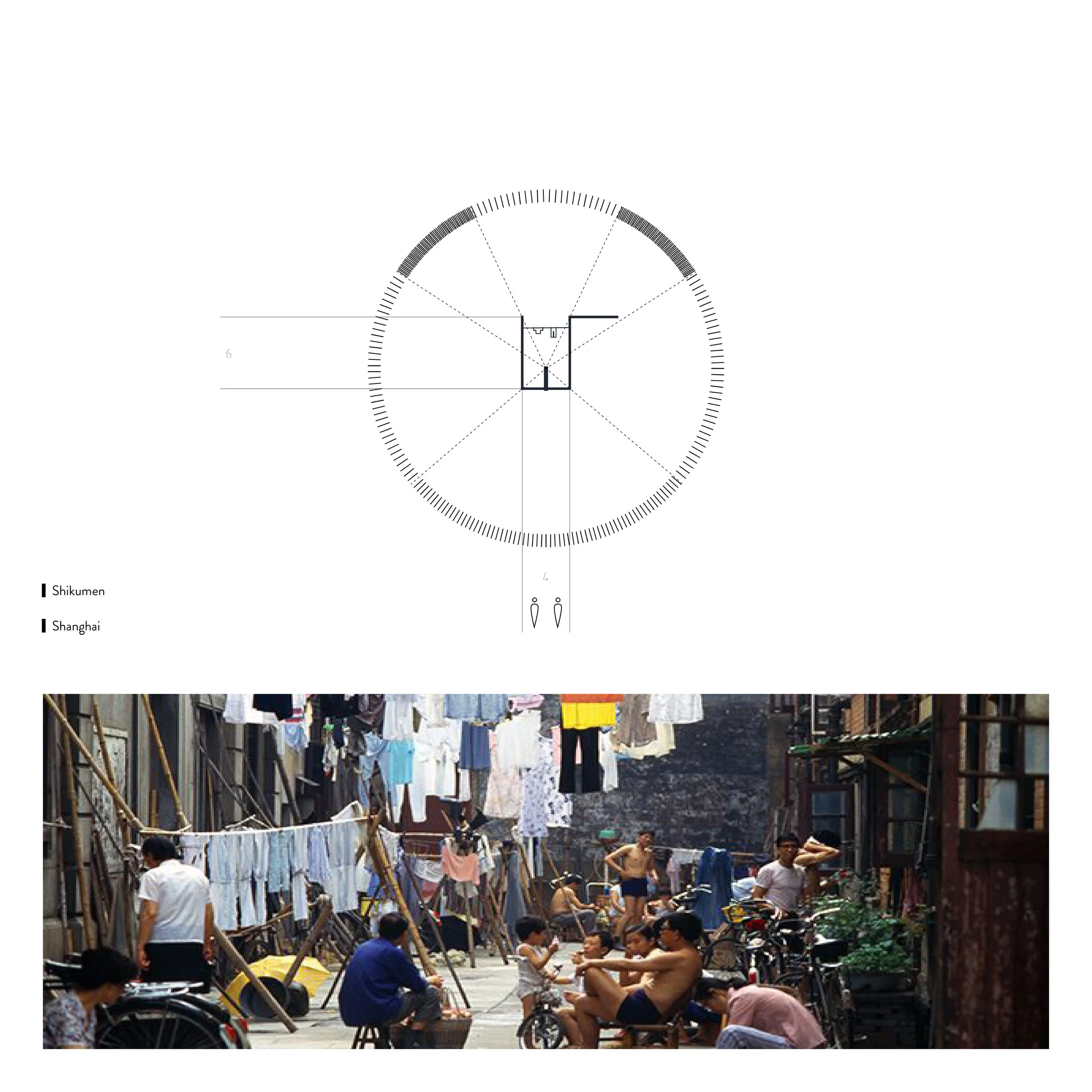
These three cases are all comparably narrow streets in their own context. The 41th Street, with a 9-meter wide asphalt vehicle lane in the middle, a 2-meter wide concrete sidewalk on both sides, 180-meter tall skyscrapers in the surrounding, depicts a figure of a cold, inhospitable artificial metropolis. The portion of “nonporous“ urban texture has exceeded 2900 out of 3600 according to the diagram. The typical streets in the Gothic City zone in Barcelona and in Shikumen area in Shanghai, in the contrary, is an entirely different story. These two zones are developed from centuries ago
when vehicles haven’t been introduced to the certain places. People have been walking along the streets and lanes from then to today, shopping in the family-run stores, hanging out with friends and chatting with neighbors. The ground floor is private but also public to some extent. People are able to look through the “porous” structure and get engaged in the local residential life visually and physically. There are very few trees in sight, although small personal plants may appear occasionally. But the hanging ropes and clothing drying in the air make a new layer of the canopy of the street, which serves as a unique “ceiling” of the outside “living room”.
4) Eixample vs Passeig de Gràcia, Barcelona
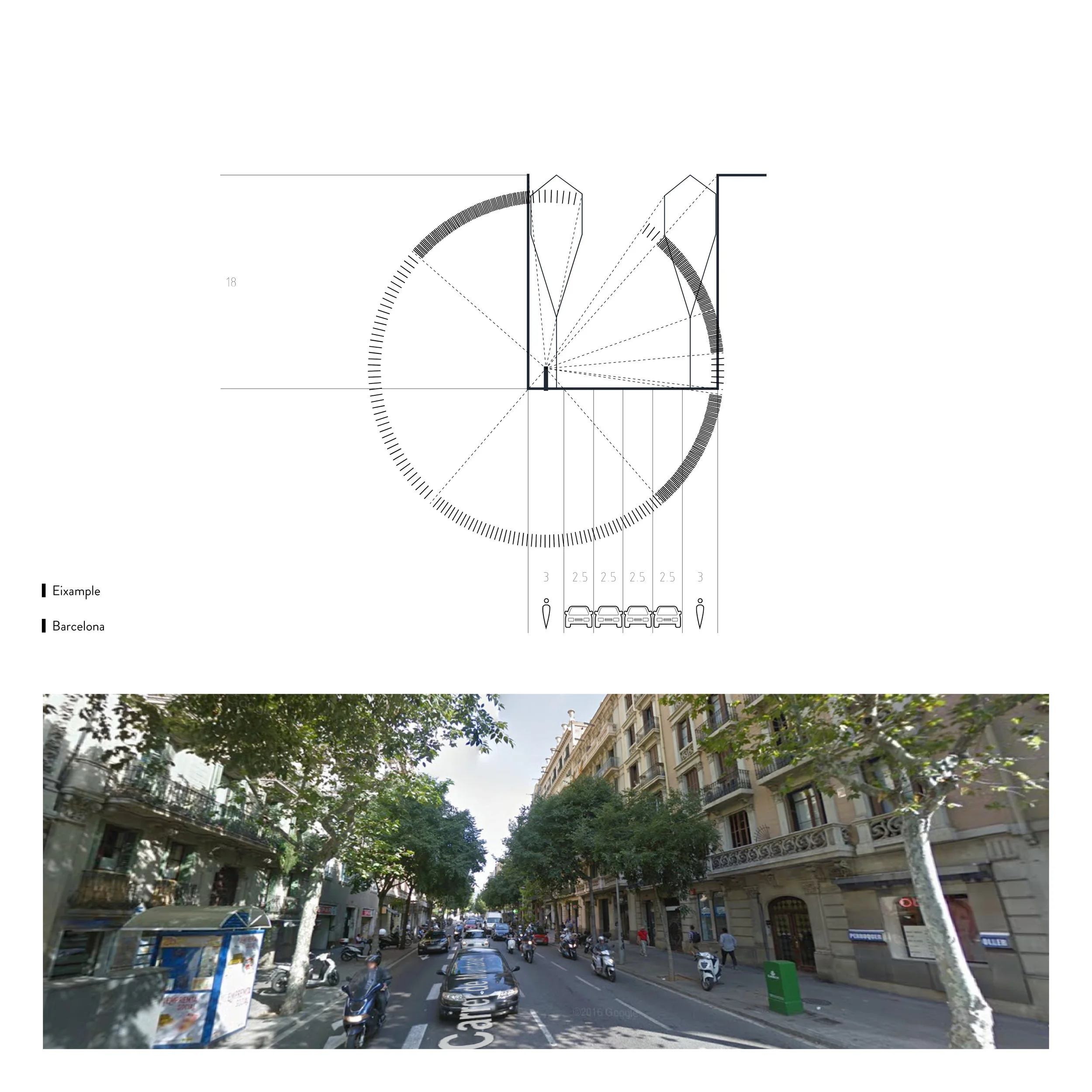
These two examples both provide agreeable walking experiences but with a contrasting width of the streets. Buildings are all of 5 to 6 floors high, approximately. While the typical street width of the Eixample is about 16 meters, with that of the Passeig de Gràcia about 60 meters. The reason why people wouldn’t notice the considerable change between these two, or they even prefer the latter to the former, is that a “good” distribution of porousness has been maintained. From the diagram we can see, by dividing the road into 8 car lanes ( 24 meters in total) and 4 pedestrian lanes (34 meters in total) and planting tall as well as wide-branching trees wherever a car lane and a pedestrian lane meet. This rhythm helps to lower the homogeneity of the street and makes a comfortable room for pedestrians in any of these 4 walking zones.
CONCLUSIONS
Through comparing the ten cases, the following conclusions can be made.
1) The scale of the street does influence how pedestrians perceive the space.
The width of vehicle lanes and sidewalk, the height of the facades of the buildings on both sides, etc. will change the angle of view of the human eye. While the dimension of these elements is not the only factor that determines the street to be comfortable or not.
2) The “porosity” of the three key elements - canopy, facade, and pavement plays a vital role in creating a pleasant enclosure.
The canopy can be a tree’s foliage or other structures. As long as it is porous to an appropriate degree, which makes pedestrians not too exposed and give them a feeling of being protected, the canopy can be considered pleasant. Th e facade should be “porous” as well, which means to make at least the ground floor of the building more accessible both visually and physically. By using a pedestrian-friendly material of the pavement would make the “floor” of the street more hospitable.
The street is much more complicated than we can imagine. Every decision of making a lane wider, planting a different species of tree, or changing the entrance of a building can have a profound impact on the composition of the street, thus transform the life of the residents in the neighborhood in an unexpected way. Studying the rules of making an inviting street should be doubtless necessary and excessively meaningful.


